 Are you starting to stare at the interior walls within your home thinking it’s time for an upgrade? Starting to feel that the décor you have scattered around no longer looks good with the paint color you picked five years ago? Whether you're moving into a new home or ready to update your current home, you want to choose just the right paint color that makes you smile every time you enter the room.
Colors of 2019
Living Coral 16-1546 has been chosen as Pantone’s Color of the Year. The bright color that reminds us of the coral in the sea may not be the color for your entire room (but if bright colors are your jam then by all means go for it!), but it can be a fantastic accent color to any wall or design. They also have different palletes showcasing other colors that can be used with Living Coral.
Did you know that Pantone isn’t the only company to have a Color of the Year? Many of the popular paint companies also pick one each year.
Behr, the popular paint brand that has a bear as its logo, chose a beautiful slate gray called Blueprint S470-5 as their color. To help you use their color, they offer you different palletes you can use that feature Blueprint, the option to create your own pallete with Blueprint, and several how-to video products to see Blueprint in action throughout your home.
Benjamin Moore chose Metropolitan AF-690 as its color, describing it as a stylish gray with cool undertones, reflecting the modern sophistication of 21st-century design. To help you see their color in different designs, they pair Metropolitan with 15 harmonious colors along with showing you different ways to best portray it in your home.
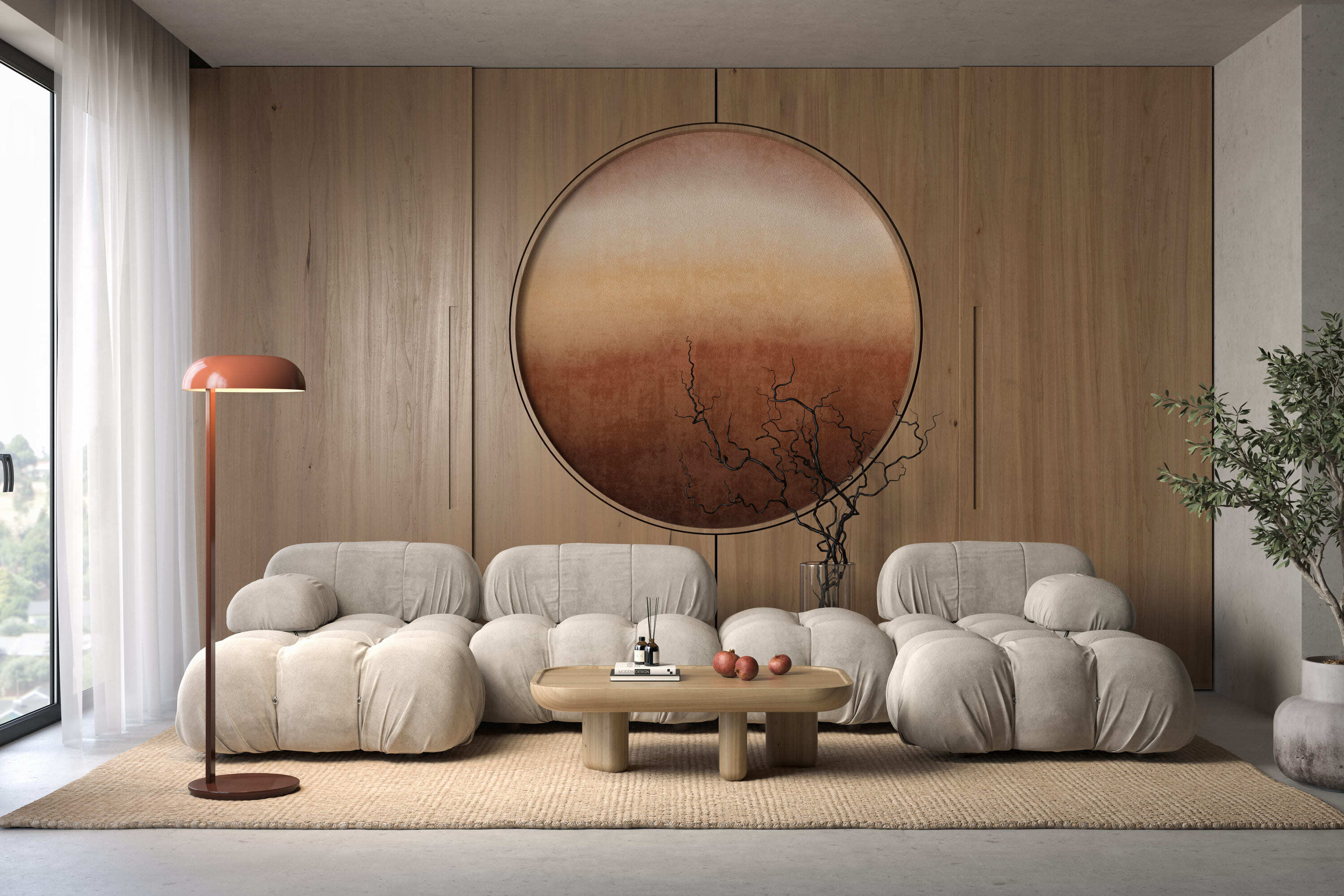
Sherwin-Williams chose Cavern Clay SW 7701 as its color, describing it as a warm terracotta color with ancient, elemental roots. It’s a nod to mid-century modern style, but with the soul of the American Southwest, which together creates a desert modern aesthetic.
PPG Diamond chose Nightwatch PPG 1145-7 as its color, describing it as a rich, luxurious, and classic shade of green that emulates the feeling of lush greenery along with the healing power of nature.
Other Popular Colors of 2019
Stainless Steel 37B-4 by Clark+Kensington: described as a medium light shade of cyan-blue (think periwinkle) and works great as an accent color to brighten things up.
Reflecting Pool HGSW 2324 by HGTV Home by Sherwin-Williams: part of their Sophisticated Whimsy color collection, with its hints of blue and green, it's a color of many personalities from soft and calming to bold and energizing.
Orange Slice 2002-1B by Valspar: as just one of the colors that Valspar chose this year, they said that this artificial intensity of orange invites an open, experimental mindset that keeps us guessing.
Keep In Mind When Picking Colors
When picking paint colors, make sure you take into account these things:
- Your current furniture. It’s way easier to find paint that coordinates with your furniture than finding new furniture that coordinates with your paint color.
- The artwork on your wall. Taking a look at the colors in the art upon your walls may help determine what kind of paint colors you should lean towards.
- Samples. No matter how confident you feel about the next color you (think) you found to grace your walls, buy a sample and test it. Lighting plays a huge factor on how the color will turn out, and no one has the same bright lights shinning in their home that a home improvement store has.
Follow These Two Rules
Rule #1: The Rule of Three is exactly what it sounds like, stick with just three colors. It’s a tried and true method that keeps you from going way above and beyond the call of color picking. Being limited to just three colors helps narrow down the possibilities you have, making sure that they all go together.
Rule #2: According to the designer Mark McCauley, the 60-30-10 Ratio Rule allows you to ensure that the colors in your space are evenly balanced with the allotted pop of color that draws the eye. McCauley says, “When decorating a space, divide the colors into components of 60 percent of a dominant color (walls), 30 percent of a secondary color (upholstery) and 10 percent of an accent color (accessories).”
Now for the next step, starting to paint. If you don't feel like doing the job yourself, contact Experts in Your Home - we do more than you think!


